Building a new canvas for in-game advertising
Brands wanted to appear inside Counter-Strike 2. The game was never built to let them. I went through all seven competitive maps, worked out every surface a brand could actually occupy, and wrote the specification that every campaign since has been built on.
The finished activation in play: a branded skybox over the map, branded gloves in the player's hands, and brand artwork on the map's own signage. Ten seconds of gameplay, no audio. Capture credit to be confirmed before launch.
What this is, for people who don't play
Counter-Strike 2 is a competitive shooter built on Valve's Source 2 engine. Everything a player sees is an asset the engine loads from packaged files — the walls, the signs, the sky, the gloves on the player's own hands. Those files are not meant to be edited from outside, and the formats are not publicly documented.
Allstar is a platform built around gameplay clips: players capture their best moments and share them. That makes the game world itself the advertising surface. Put a brand convincingly into the world and it travels with every clip — no ad unit, no overlay, nothing a player would want to skip.
The hard part is the word "convincingly". It has to look like it belongs, it has to survive a live competitive match, and it has to be repeatable, because a one-off hack is not a business.
Four surfaces
The launch activation, for the skin marketplace SkinBaron, had four parts. Each one is a different kind of surface, and each behaves differently once the match starts.
- Map signage — the posters, bombsite letters and shop signs already in the world. The most believable surface, and the one that needed the research.
- The skybox — the entire sky above the map. Enormous, impossible to miss, and it obstructs nothing.
- Gloves — the player's own hands. Counter-Strike is first person, so the gloves are on screen almost continuously. For a clip-driven platform this is the most reliable branded surface in the game, and the easiest one to overlook.
- Impact effects — the particles that appear when a shot lands. Replacing them turns the moment a clip is made of into brand material.
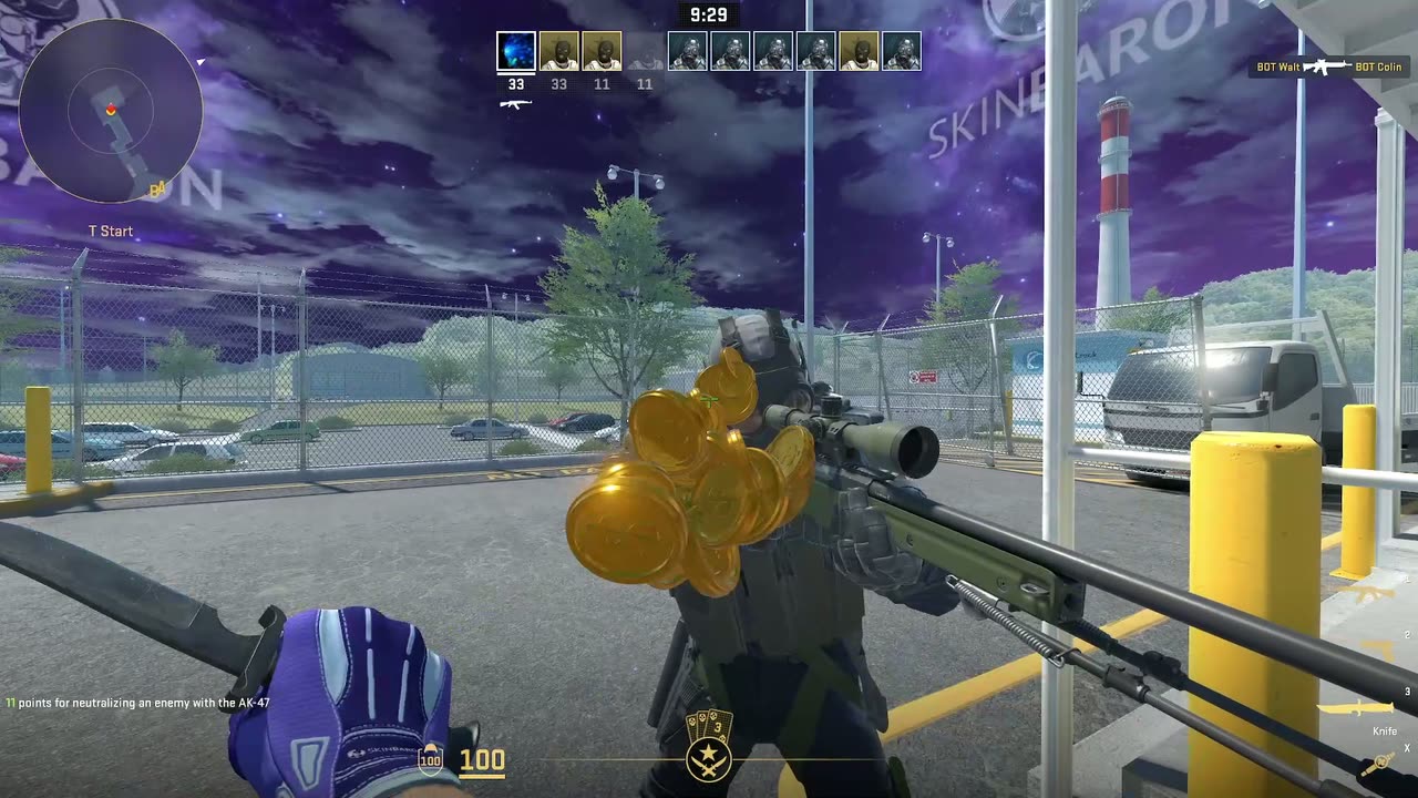
Skybox and map signage, seen from the player's position.
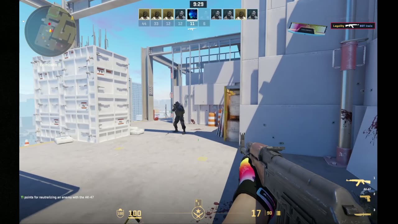
Replaced impact effects, shown here on a later activation built with the same method.
Mapping the canvas
Signage was the part with no manual. Before anyone could design an ad, somebody had to establish what was even possible: which surfaces can be replaced, what size each texture is, how much of it is usable artwork rather than frame, and what breaks when you touch it.
I went through all seven active-duty maps — Mirage, Inferno, Nuke, Dust 2, Vertigo, Ancient and Anubis — and documented every placement. The result identifies more than fifty of them, each with its file dimensions, its usable artwork area, and whether it needs transparency.
The useful findings were the awkward ones. Some files are shared between maps, so a change made for Mirage also lands in Vertigo and causes problems there. Some surfaces only accept a replacement on the map they belong to. Some bombsite pointers have no shape that any sensible artwork fits. None of that is discoverable from the outside; it only appears when you try it and watch what the engine does.
The last page of the spec is the part that mattered commercially: a recommended set of aspect ratios — square, 2:1, 16:9, 3:4, with a few documented exceptions. Standardising the shapes meant a brand could be asked for artwork without anyone re-deriving the map research each time.
The same seven sizes, every time
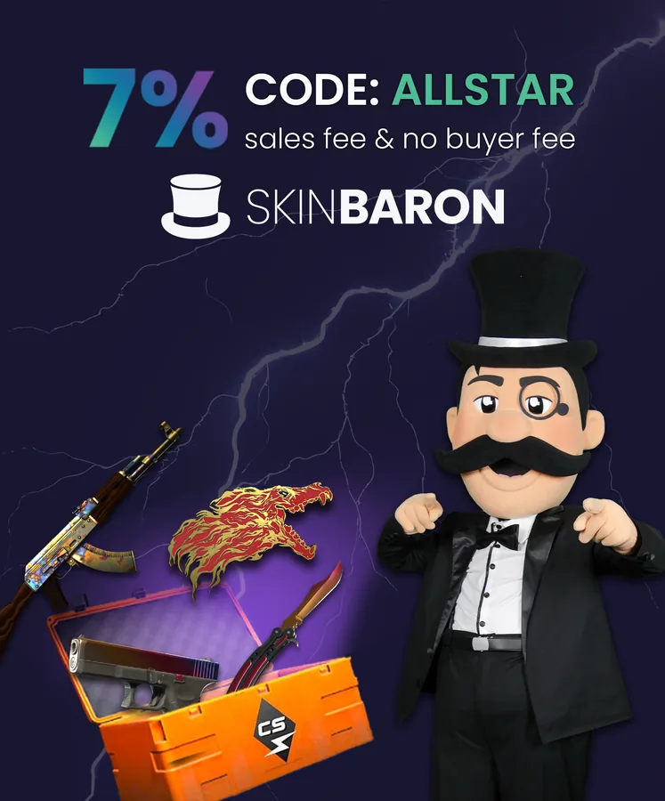
This is what the research turned into. Every campaign since delivers its artwork as the same set of files, named by the dimensions the spec established. Below: the launch activation, and a later one for a different brand, built to the identical set.



How these actually get made
The same five stages ran on every activation on this site.
- Reading the game. Opening the packaged files, pulling out the models and textures to be replaced, and finding out what the engine would accept. This is where the placement spec came from.
- Concepting in context. Not a moodboard — an image of the proposed asset in first person, on the real map, in the real lighting. I built these from the game's own frames and the brand's assets, using generative tooling to get to something convincing quickly. The output was a concept for approval, not a shipped asset.
- Building the real thing. Textures authored at the exact dimensions the spec called for, 3D work where a model was involved, and whatever reduction got a brand's product model down to something the game could carry.
- Packing it back in without breaking anything that shared the same files.
- Playing it. In a live match, at speed, at the distances players actually see things from. Most revisions came from this stage, not from the concept.
Stage two is the one worth being explicit about. Showing a client a generated picture of their gloves already in the game got a decision in a day instead of a fortnight, and because it came from the real map at the real camera height it was an honest preview rather than a flattering one. The judgement was in knowing which concept was worth building, and what had to change before it would survive a match.
What came out of it
The deliverable that outlived the campaign was the specification. The placements it established became the fixed locations for brand work on the platform, and later activations are scoped against it directly rather than starting from scratch — the research phase does not have to happen again.
That changed what the work is. The first project was an investigation with a campaign attached. Everything after it is a production job: take a brand's assets, fit them to known shapes, drop them into known slots, and spend the time on the creative instead of the plumbing.
There are initiative-wide numbers available (collaborations, user-generated clips, impressions). They stay off this page until it is clear what each one measures and how much of it attaches to this project rather than to Allstar as a whole.
Looking back
Two or three sentences in your own voice: what you would do differently, what surprised you, what this changed about how you approach a brief. This is the section that shows you think about your own work, and it is the one I cannot write for you.